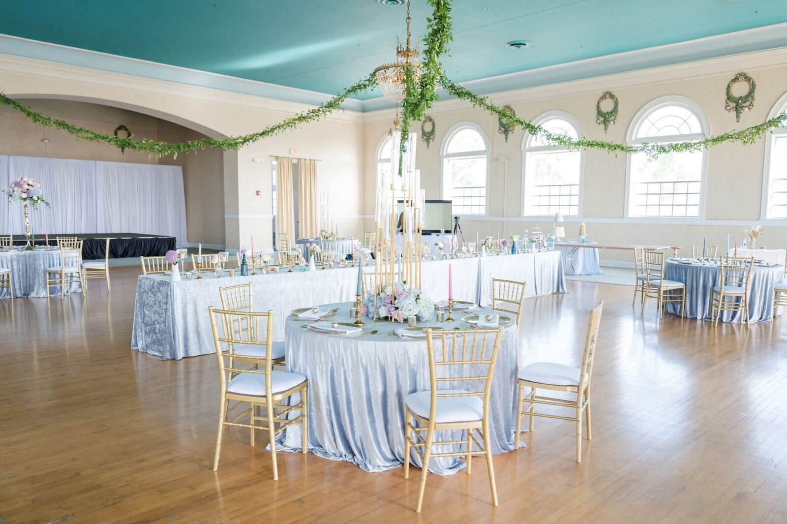
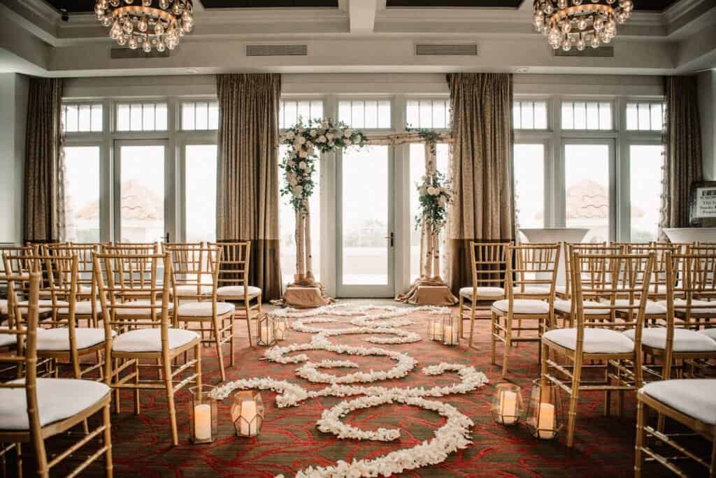
The Birchwood is a boutique hotel on Beach Drive with a proper old ballroom above it: coffered ceiling, chandeliers, tall windows onto the park, and a patterned carpet that has been there a long time. Rooms like this are already warm and already busy, which makes a soft eucalyptus-green and blush scheme a harder brief than it sounds. The colours are quiet; the room is not.
Gabro’s order covered most of what a guest actually touches: the Chiavari seating for the ceremony and the dinner, the tables, the linens and napkins, the flatware and the backdrops. Here is how those were specified to work with the room rather than against it.
Gold Chiavari in both rooms
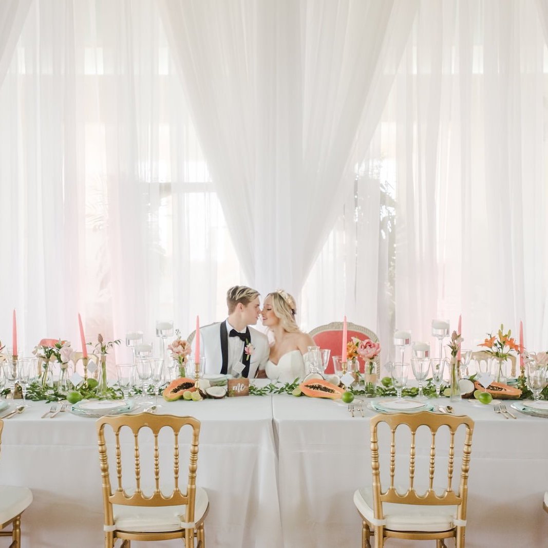
The same gold Chiavari was used for the ceremony rows and for the dinner tables. Using one chair across the whole day is the quiet decision that holds a wedding together visually, and in a historic hotel it is also the practical one — a single chair means a single count, one delivery, and a reset that moves chairs rather than swapping them out for a different product mid-afternoon.
Gold is the right finish for this particular room. The carpet is warm and patterned, the chandeliers are warm, and the light through the windows is warm for most of the day. A black or silver frame in that setting reads as a cool object dropped into a warm room, and it will not agree with the carpet from any angle.
The frame does the other half of the work. A ballroom with tall windows sells itself on light and on the view out of them, and a solid-backed chair repeated across a room builds an opaque band at exactly the height that blocks both. The Chiavari’s open back keeps the windows readable from the far side of the room, which is why the wide photographs of the ceremony still show the light rather than the furniture.
Shop this look

Ivory linen, a blush napkin, gold flatware
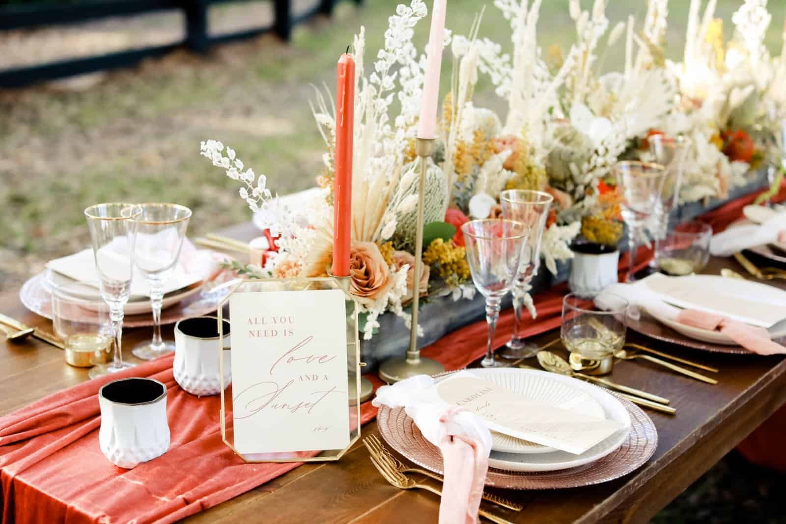
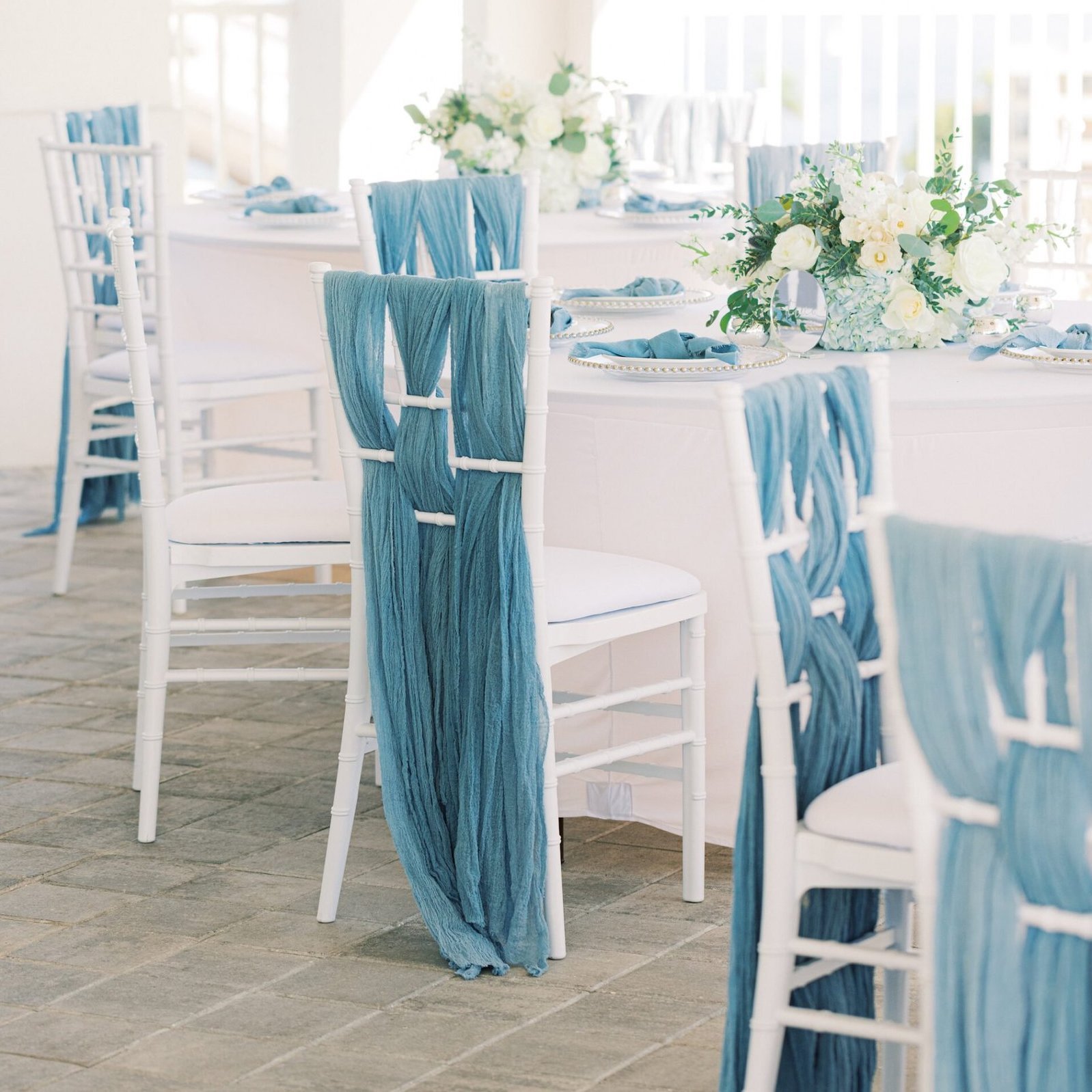
The tables ran floor-length ivory linen, with a blush napkin at each place and gold flatware over the top. That is a deliberate three-layer structure and it is worth copying: the largest surface is neutral, the accent colour sits on the smallest replaceable item, and the metal ties back to the chairs.
Floor-length is not optional over a hotel’s carpet. A patterned carpet is doing its own visual work under every table, and a short cloth leaves a band of it visible at eye level from across the room along with the table legs and crossbars. Taking the linen to the floor removes both and gives the room a consistent base tone that the carpet cannot interrupt.
Ivory rather than pure white is the choice that respects the room. Under warm chandeliers and warm carpet, a bright white cloth reads slightly blue and slightly clinical; ivory carries the same warmth as the room and photographs as clean rather than cold. The napkin is then the cheapest way to put the scheme’s colour on the table — it is the item that can be changed at the last minute if the flowers shift, and it is what a guest sees first from the doorway. Gold flatware finishes the setting and needs handling as a finish rather than as steel: hand-dried, never scoured, and counted carefully at strike because warm-toned pieces do not catch the eye in a bus tub.
Shop this look

Backdrops that give a ballroom a focal point
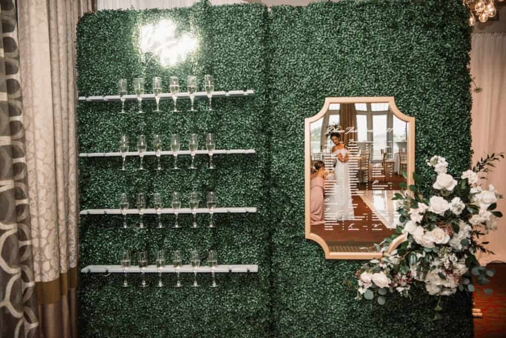
Two backdrops came from the same order: a green hedge wall, used as a champagne wall with a mirror and again behind the dancing, and a lettered panel behind the cake. A ballroom with windows on one side has a problem the photographs make obvious — there is no obvious place to put anything. Every wall is either glazed, panelled or has a door in it.
A freestanding backdrop invents a wall where you want one. It gives the champagne moment somewhere to happen that is not a corridor, it gives the cake a clean field instead of patterned wallpaper, and it gives the first dance a background that does not change depending on which way the photographer is standing.
A hedge is the right choice over fabric here, for a reason specific to a warm, patterned room. Flat drape in front of a decorated wall reads as something being covered up. A hedge reads as a built element with real texture, and its green sits directly in the scheme rather than being a neutral. Structurally it behaves like drape — modular panels on a frame with weighted feet — so the two questions are always how much width you need and how much floor you can give up to stand it safely upright, clear of any exit.
Shop this look
Designing into a room that already has a palette?
Chairs, tables, linens, tableware and backdrops come from one order across Tampa Bay, specified against the carpet and the light you actually have.
Wedding Credits
Venue: The Birchwood · Planning: Perfecting The Plan · Cake: The Artistic Whisk · Chiavari Chairs, Tables, Linens, Napkins, Flatware and Backdrops: Gabro Event Services · Originally featured on Marry Me Tampa Bay.